Key Points
Intro: For this project my partner and I were given a short exhibition brief that went over the goals and content of the exhibition. The exhibition we were given was about the industrialization of farming and how prioritizing quantity and perfection in food is resulting in less nutritious and sometimes unhealthy food.
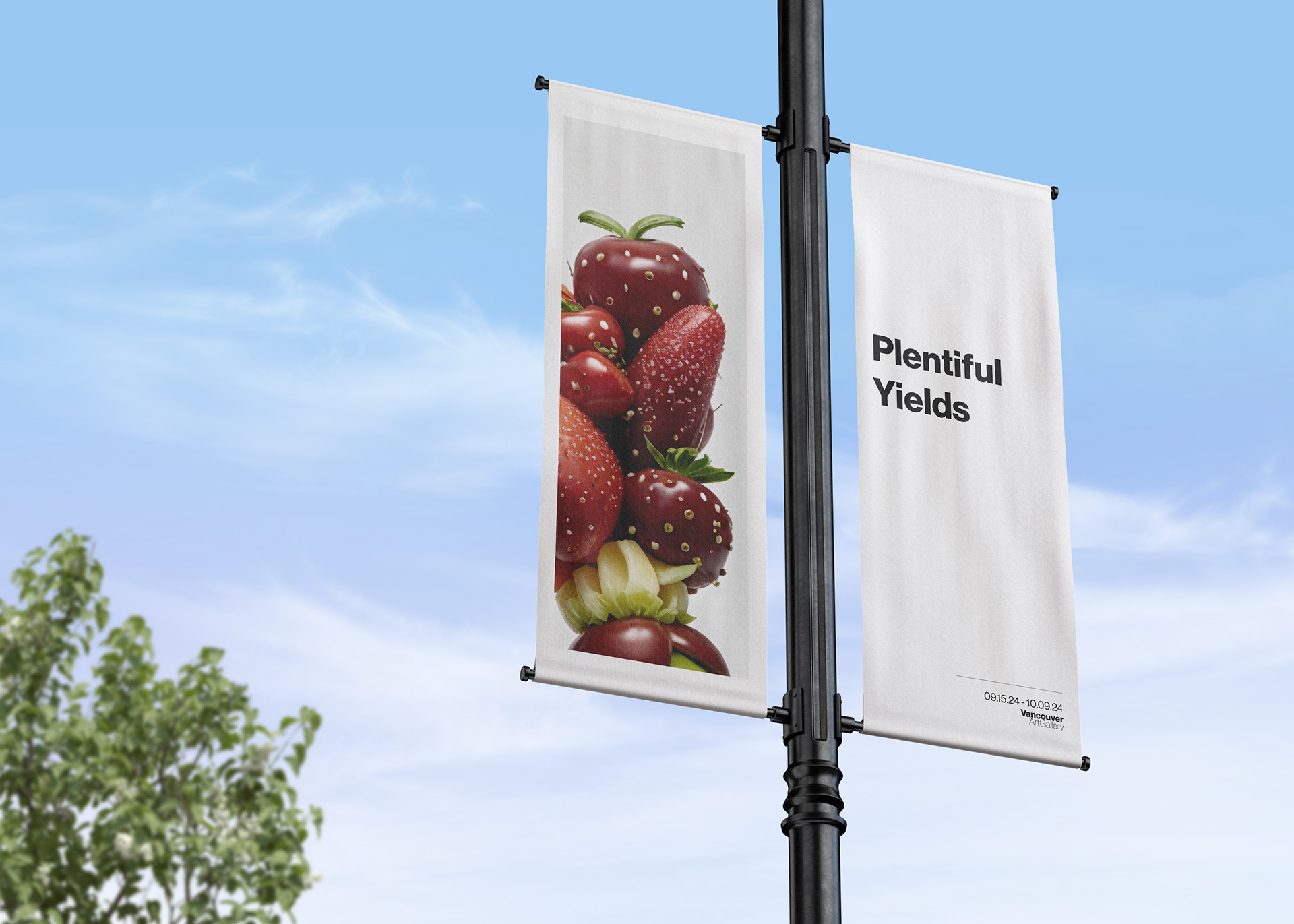
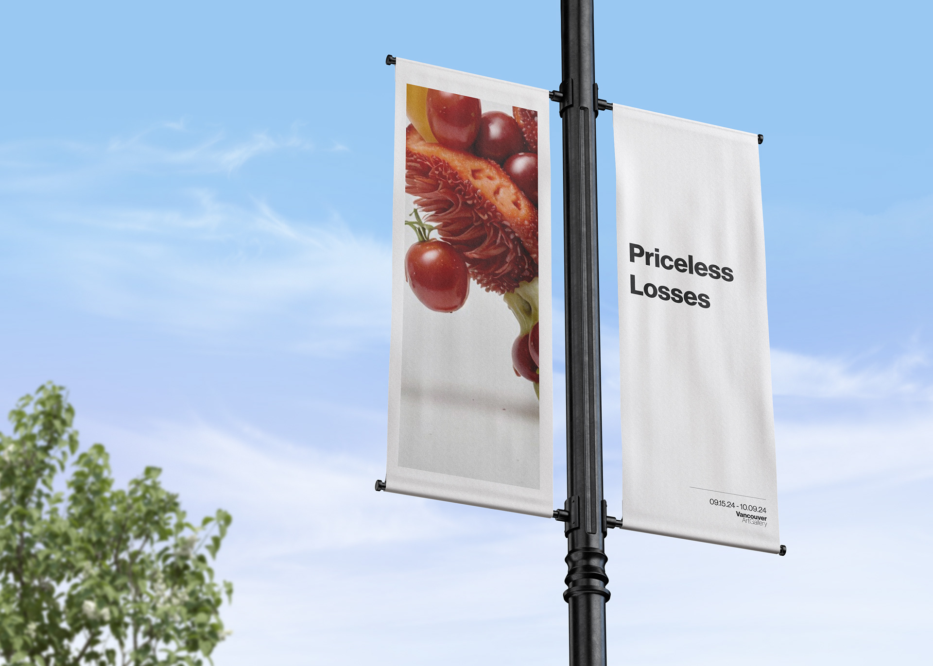
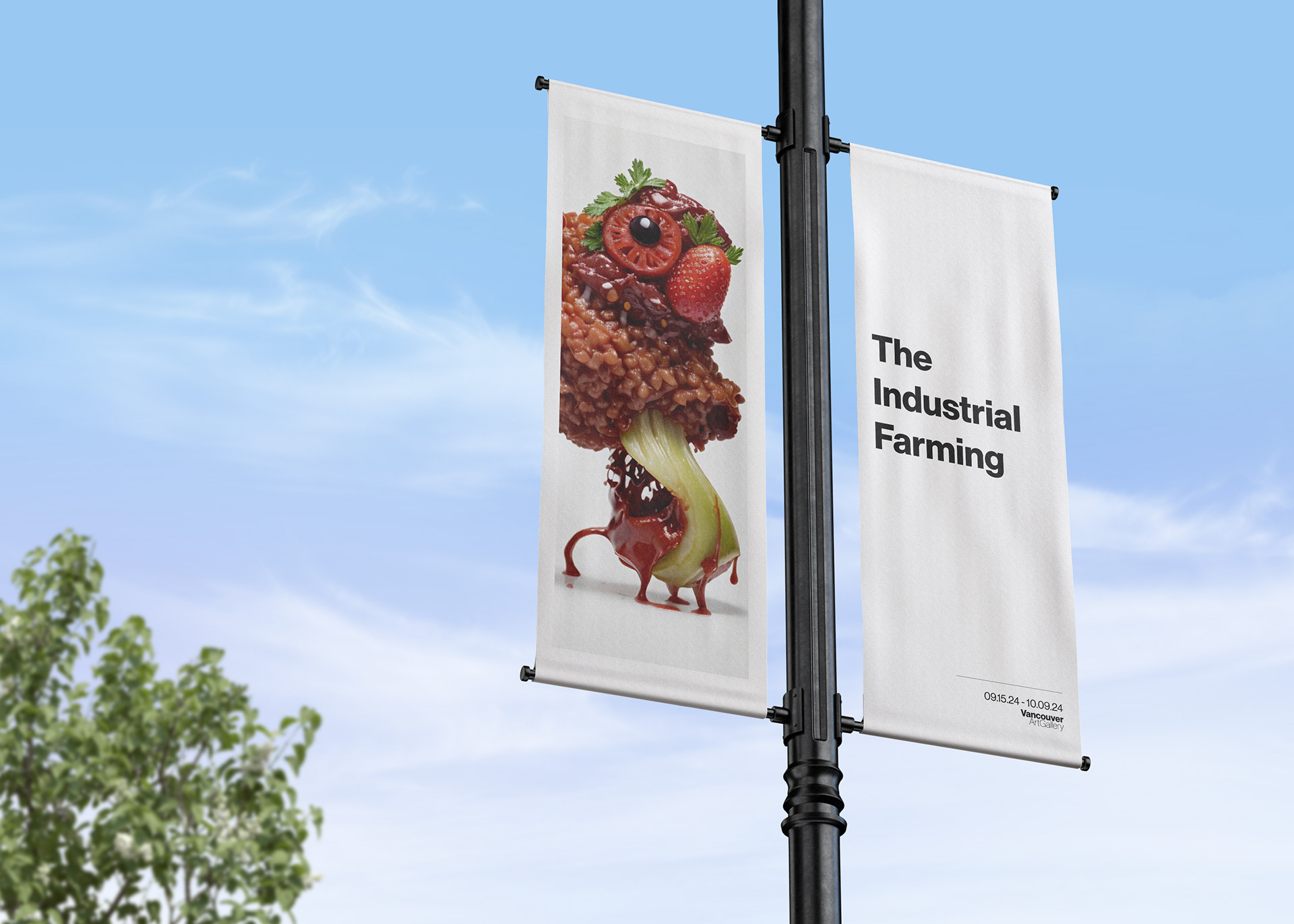
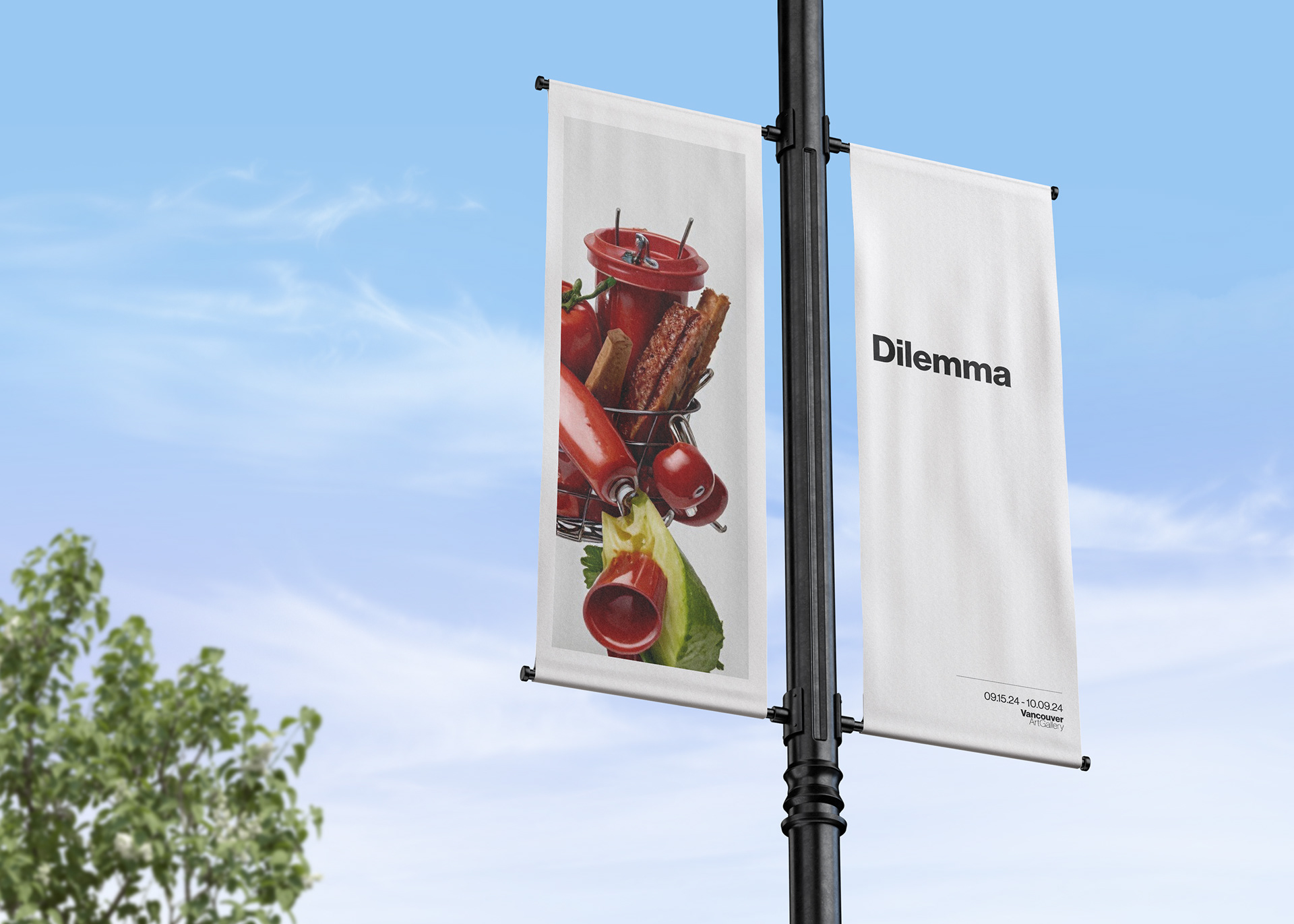
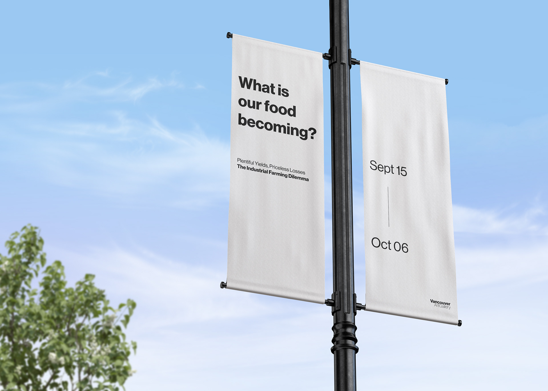
We used frames and small simple black text along with larger images in order to represent a gallery aesthetic. We chose this aesthetic because it makes the images seem more surreal and encourages the viewer to ponder the message of the image more deeply.
We chose to use AI generated images for the visuals of the campaign because of the off putting and artificial nature of the images it produces. We then paired it with language that may seem positive on the surface but when put in context with the images, has a darker undertone. This juxtaposition tells the unsettling story of industrial farming in a multi-layered way.
Process
Developing two campaign approaches and identifying and combining the strongest points from each.