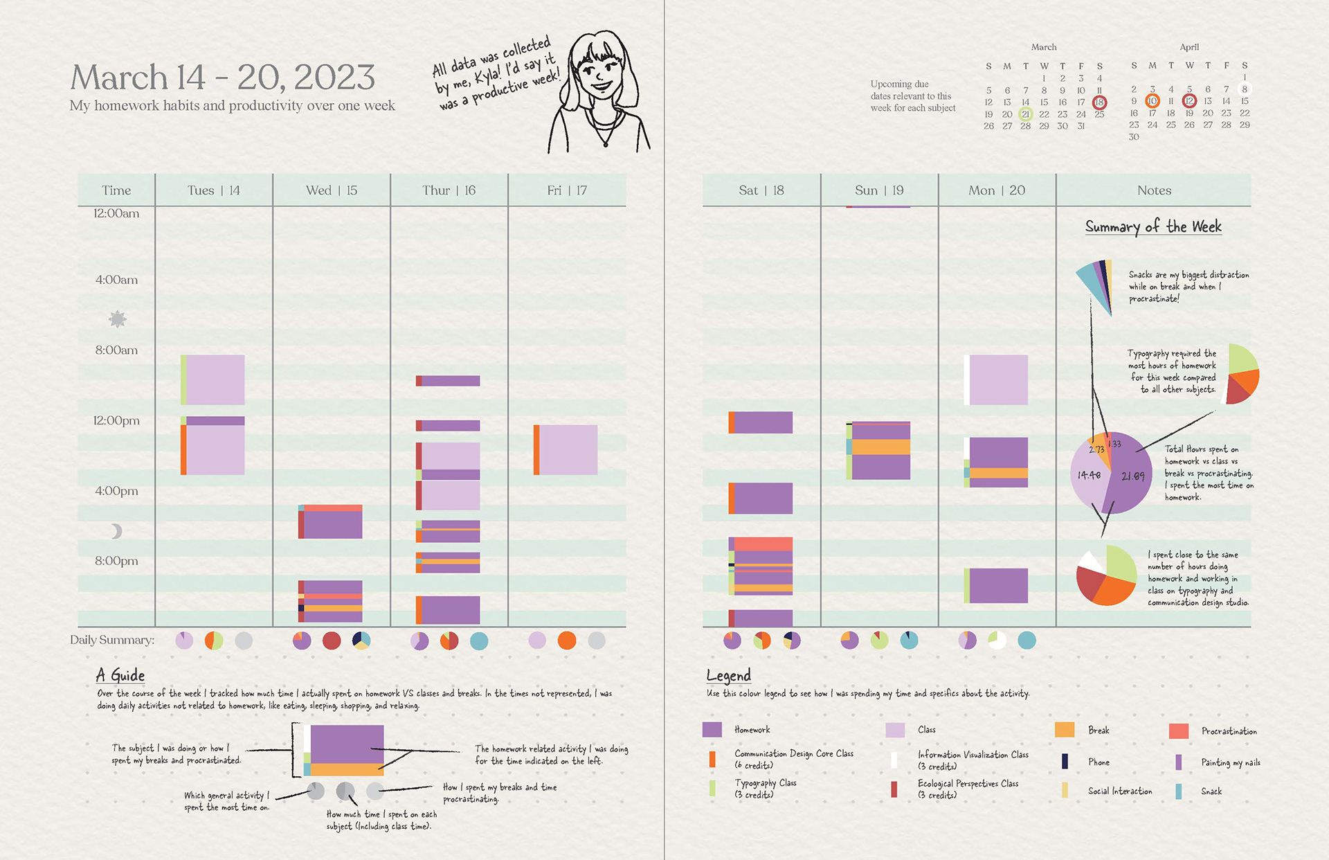
Key points
For this data visualization I collected a series of data over the course of one week around my study habits in order to develop insights into my productivity.
I chose to use the layout of an agenda in order to incorporate the topic of the data, as an effective way of visualizing the passing of time, and because it is a familiar format for my target audience of university students.
I used bar graphs, pie charts, and a colour legend in order to represent multiple different sets of data in one visualization.